Written by: Casey Smith, Docs @ Payabli
Finding the right doc shouldn’t feel like a scavenger hunt. That’s why we launched some big changes to how Payabli’s docs are organized. We completely reimagined the navigation and content organization to make it easier for our readers to find what they need and get on with their day.
Here’s what’s changing, why it matters, and what’s coming next.
What’s changed
Navigation that matches how you actually work
Before: Four separate sections (Home, Learning, Developers, Product docs) that forced you to guess where content lived. API guides in one place, UI guides somewhere else, concepts scattered across a “Learning” section you probably didn’t know we had.
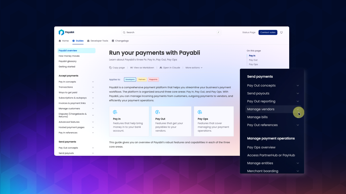
Now: Three clean tabs organized by what you’re trying to do:
Changelogs: Version history and updates
Guides: Concepts, procedures, and troubleshooting for everyone
Developer Tools: API reference, SDKs, and testing resources
No more hunting across multiple sections. No more “is this in Developer docs or UI docs, or is it Learning?”
Shallower navigation, less hunting
We flattened the navigation hierarchy. Some things that took 5-6 clicks now take 2-3. Others went from 5 to 3. But the real difference is you’re not jumping all over the screen anymore.
For example, getting to the V2 Transaction Endpoints used to look like this:
Product tab (top nav) → Developers → API Reference →
scroll down → Pay In Endpoints → V2 Transaction Endpoints
Now it’s:
Developer Tools → Pay In Endpoints → V2 Transaction Endpoints
Three clicks instead of five, and they’re all in the same navigation area. Less clicking, less hunting, less confusion.
Old way:

New way:
